
Build your gauge image
Set value, maximum, colors and label, then download the PNG or copy the dynamic gauge URL.
Four dials on one board, redrawn whenever the numbers move
A dashboard is read as a whole: uptime beside spend beside conversion, each dial with its own scale and its own healthy range. DynaPictures lets you place several gauge layers on a single board and send all of the current values in one API request, and the composed image comes back in under 300 ms.
How to make a gauge chart image
Set value and maximum
Type the current value and the end of the scale, for example 72 of 100. The needle position is calculated from the two numbers.
Choose colors, label and size
Pick the arc, needle and background colors, add a short label under the dial and set the pixel size of the image.
Download or copy the URL
Save the PNG, or copy the dynamic URL and change value= (and max= if needed) whenever the number changes.
Why make gauge images here
One number, one picture
A gauge shows how close a value is to its target at a glance, with no legend or axis to read.
Needle driven by the URL
Change ?value= in the image URL and the next request draws the needle at the new position.
Shows where scripts do not run
The gauge is a plain PNG, so it renders in HTML emails, Notion, Slack, Confluence and GitHub READMEs.
Your scale and colors
Set any maximum, not only 100, and match brand colors with hex values.
No charting library
Nothing to install or bundle; rendering happens on our servers and you embed a single img tag.
How the dynamic gauge URL works
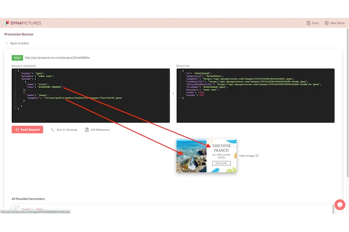
Each gauge you configure gets an id. Requesting /tools/d/YOUR-ID.png?value=72&max=100 makes our renderer draw the radial gauge with the needle at 72 percent of the arc and return a PNG. Colors, label and size are stored with the id, so the URL only needs the numbers, and values above the maximum are drawn at the end of the scale. The free tool draws a single radial gauge with one needle. The DynaPictures platform is where you design richer KPI templates with several dials, a logo and text, rendered through the API, Zapier, Make or a spreadsheet.
Free limits
20 renders per day per visitor. Each dynamic URL serves up to 1,000 views or 30 days, then shows a small upgrade notice.
More than one gauge
The DynaPictures platform renders KPI templates with several gauges, logos and text from the API, Zapier or Make.
Parameters
value= sets the needle, max= sets the end of the scale. Both are plain numbers; decimals such as value=7.5 are accepted.
<img src="https://api.dynapictures.com/tools/d/YOUR-ID.png?value=72&max=100" alt="72 of 100">Frequently asked questions
A gauge shows one value against a scale, such as 72 of 100 points, a satisfaction score or progress towards a sales target. It is read faster than a table when only one number matters.